Existing vertical conditions
torsdag 8. juli 2010
onsdag 7. juli 2010
Modeling fase TWO
I was told that mine model looked like a ziggurat. Well the shape of the Skenderija center was inspired by the famous Japanese architect Kenzo Tange. The fase of modeling things in 3d have already started. the phase one is building physical model, scale 1:200. Here comes firs picture of 3d model. The model is of existing structure, mine interventions are still under production. Many things to settle, but things are taking shape.
søndag 4. juli 2010
INSPIRATION
Seeking inspiration I came across these project on the net. One of them is done by a Brazilian architect which I have posted before (Lina Bo Bardi).
Meydan Shopping,
center with green roof in Istanbul. The center Meydan was designed by Foreign Office Architects, of London. The center includes other very significant green features, specifically, air conditioning provided by a geothermal plant and skylights to provide natural lighting to the concourse walkways and retail stores.
Inspiration of using the existing structure. A park with an arresting history as the grounds of a notorious prison, with leftover structures still standing. Made by architect Gian Carlo Gasperini from Brazil. The Parque da Juventude (“Park of Youth”)
SESC Pompeia
SESC Pompeia is a project from architect Lina Bo Bardi in Sao Paulo. This project reminded me what I was doing in Sarajevo, TRANSFORMING an existing structure to new use and create possible solutions. Its great project from Brazilian architect, with use of rough concrete.
tirsdag 22. juni 2010
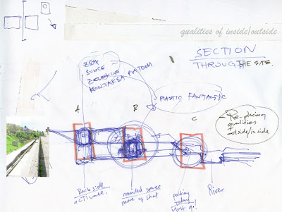
SECTIONS
I have given my self a new task! Its to draw the sections shown in plan (until tomorrow) to understand the relation between spaces. The sections are selected on background of the "game-table". I have been working in plan for quite some time, the sections will (I hope) move me towards new direction.
More work in sections
The fact is that my center is stretching over 2 levels which can be difficult to understand. Whats under/over?
So my next step is to work a lot more in sections, to show the qualities inside/outside. People are using the space inside, but its space with limited light conditions and bad air qualities. But still it "plastic-fantastic" and in this matter its a good thing, but what will happen if the inside is switched with outside? Which qualities are to be gained? Point A is outdoor situation (green area) behind the center. Its setting with landscape, street and possibilities to connect the rest of the center with the green area (the noise level is reduced from the front). Point B is the inside situation, with shopping, cafe during the day.
4 vs 1
I am questioning the location of existing entrances. Are they visible enough? Do I need all four? Can entrance be something else, lift, elevator, bigger, smaller ect.. The sketch is trying to show the situation with one big entrance to the center. It will circulate the movement inside the center, but it will not have connection with the surroundings. But four entrances, maybe relocated, can give new movement in between. It can generate new actions/spaces and have bigger potential to include the surroundings and areas around center.
Abonner på:
Innlegg (Atom)